murray st residence whole house remodel
murray st residence
location | san francisco
scope | garden level great room with full bath and office
design | building Lab
year | 2015
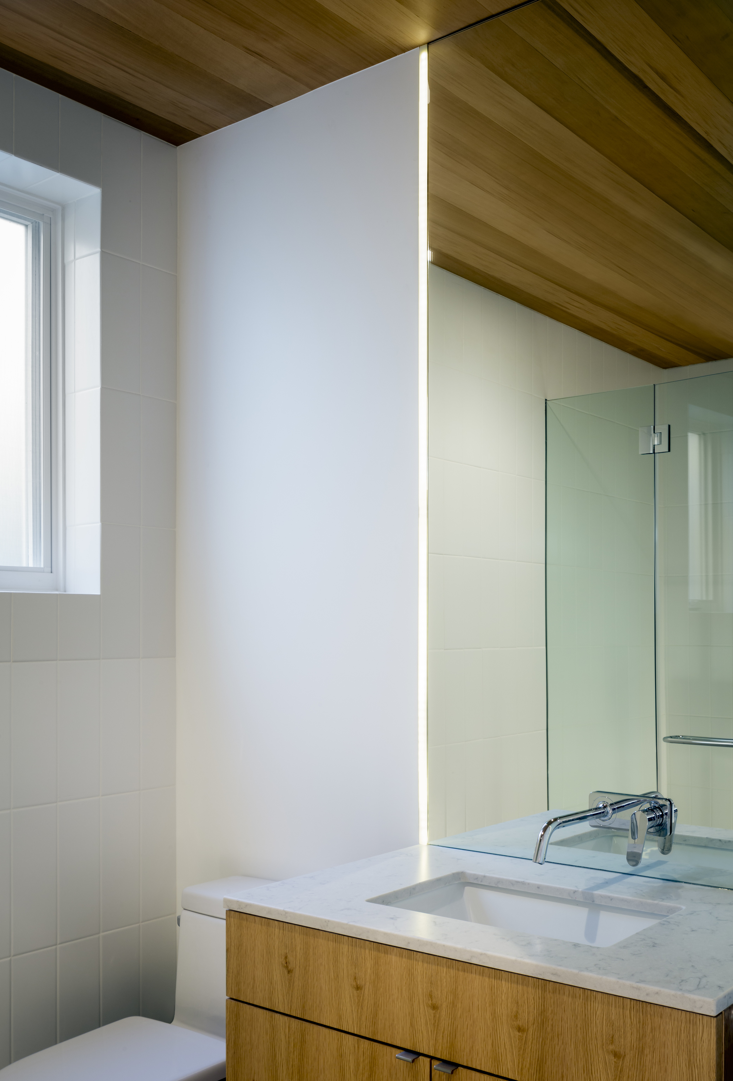
Program: The clients are a busy couple with 2 young children. Their wish was to create a multi-purpose family space/guest quarters, a full bath, plus a laundry and storage.
Primary design goals:
•   The transition from the traditional main floor down to the new
    space is smooth and unfussy
•   The space should not feel like a basement
•   The outdoor patio will not feel sunken
Early on in the process, due to budget and timeline, it was decided that this would be a ‘dig-down’ instead of an addition. As such, both the front and most of the back of this traditional residence were preserved, contrary to most renovation projects in the city.
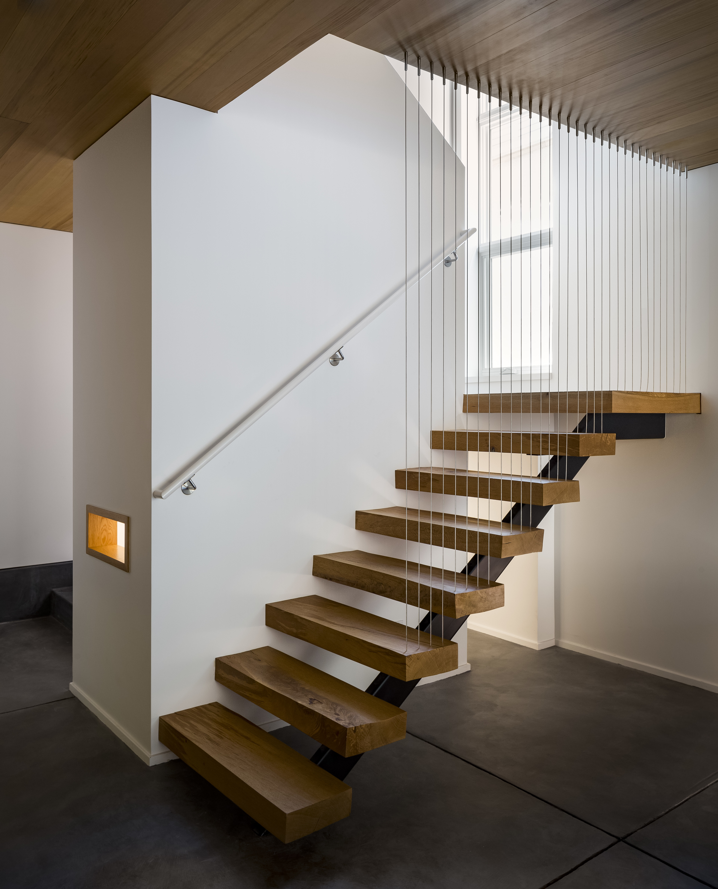
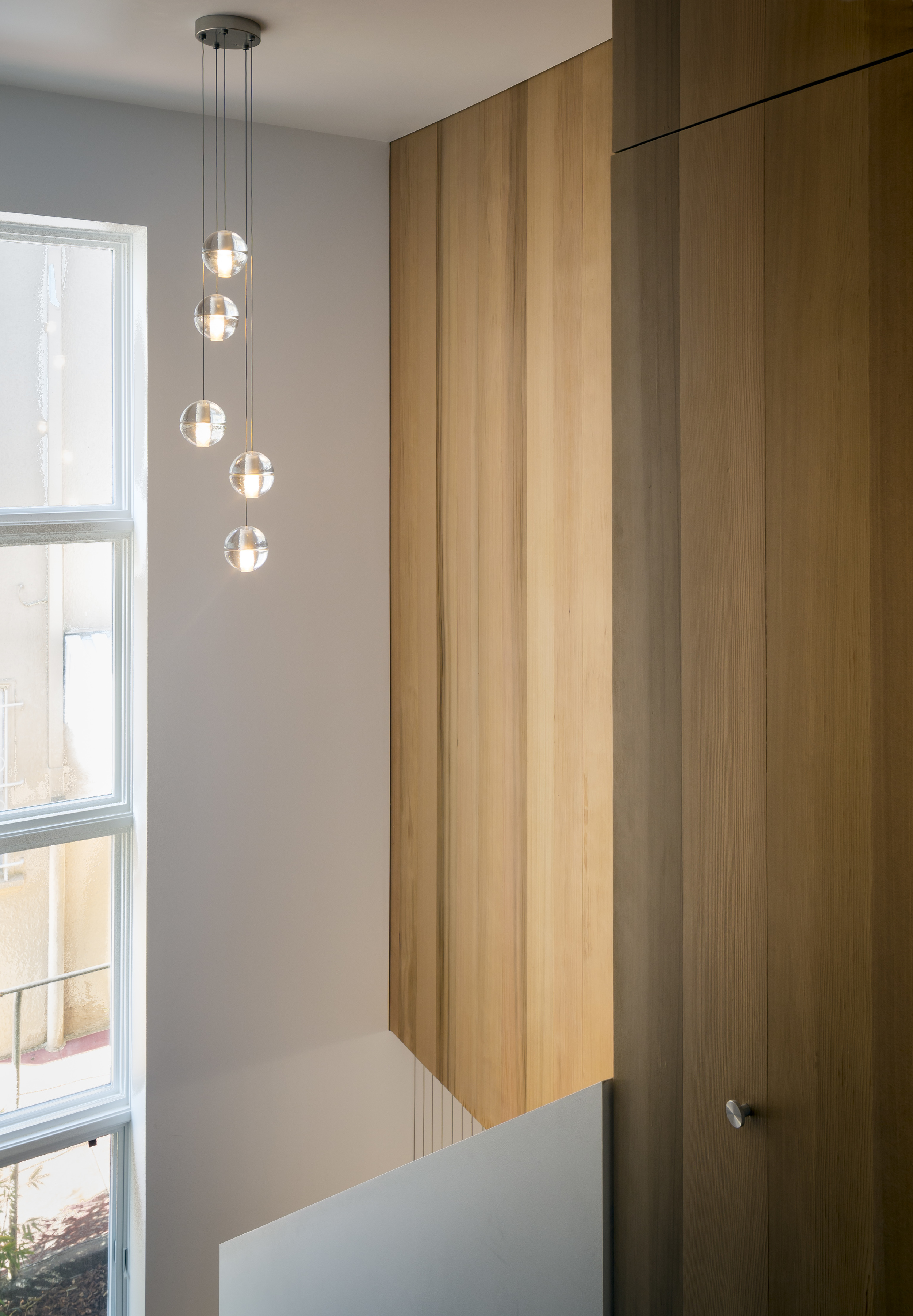
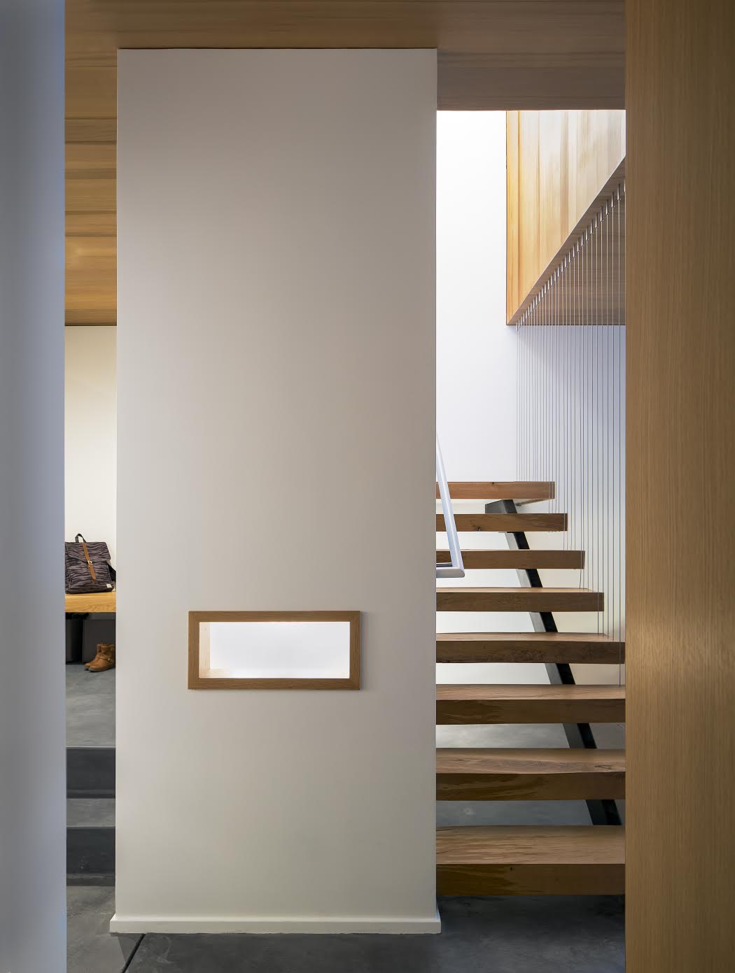
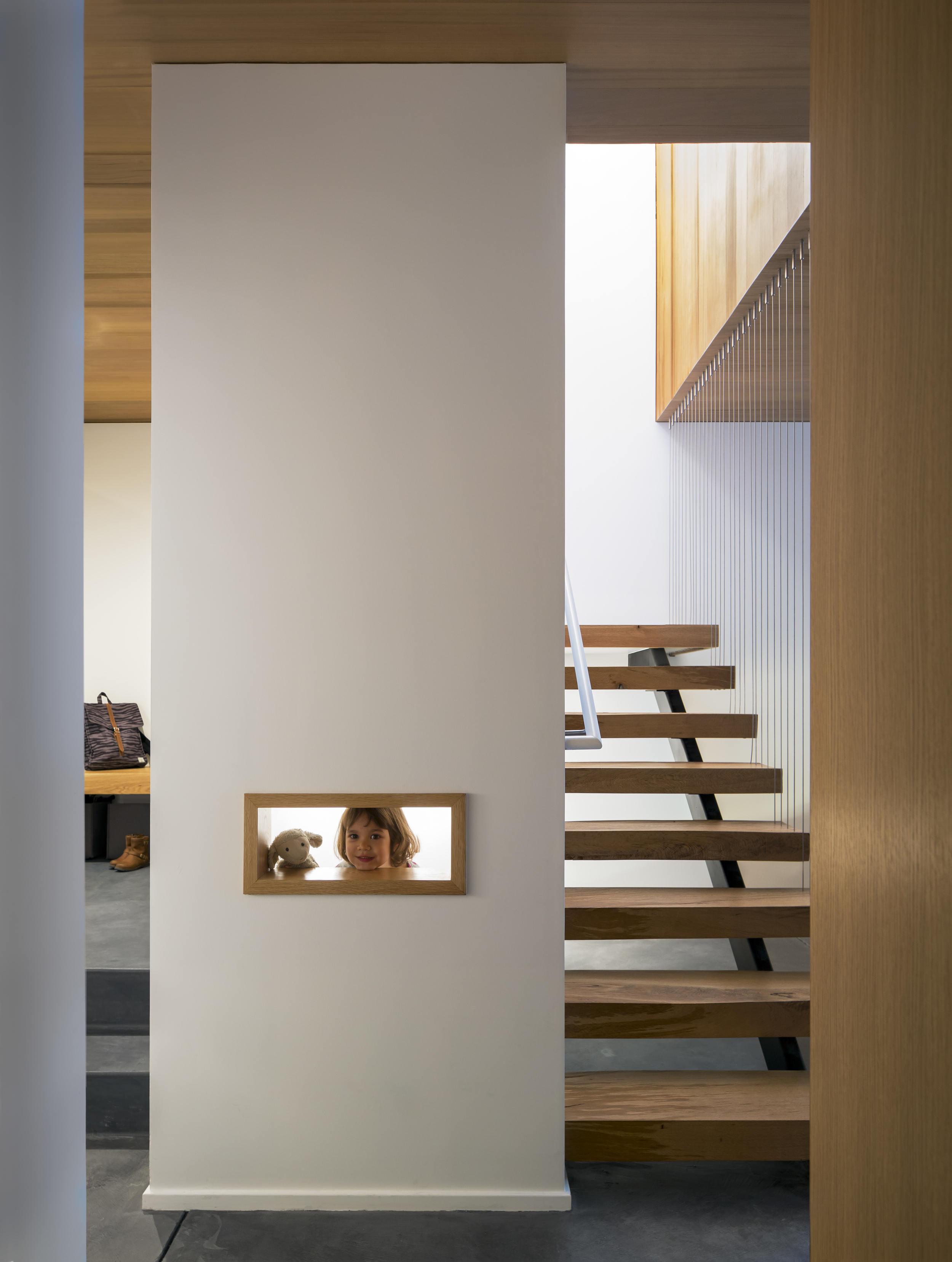
The existing living and dining on the main floor have traditional details. They give way to a kitchen remodeled by the previous owners in a transitional style. In a way, the kitchen is already signaling a kind of transition. The new entrance to the lower level is moved from the kitchen to the hallway around the corner. A wood-framed glass pocket door slides open and one steps down from the existing oak hardwood floor onto new treads crafted from reclaimed oak. Both the new stairs and wood window frames at this juncture materially tie to the upstairs trims and details, while the cedar paneling of the downstairs ceiling wraps around and reaches up the vertical surfaces of the stairwell. The pendant fixture looks both modern and vintage with its hand-blown globes. Materials interlock and embrace one another while the verticality of the stairwell makes the decent into the new space a dramatic experience. This is further enhanced as the semi-enclosed stairs turn into floating oak logs.
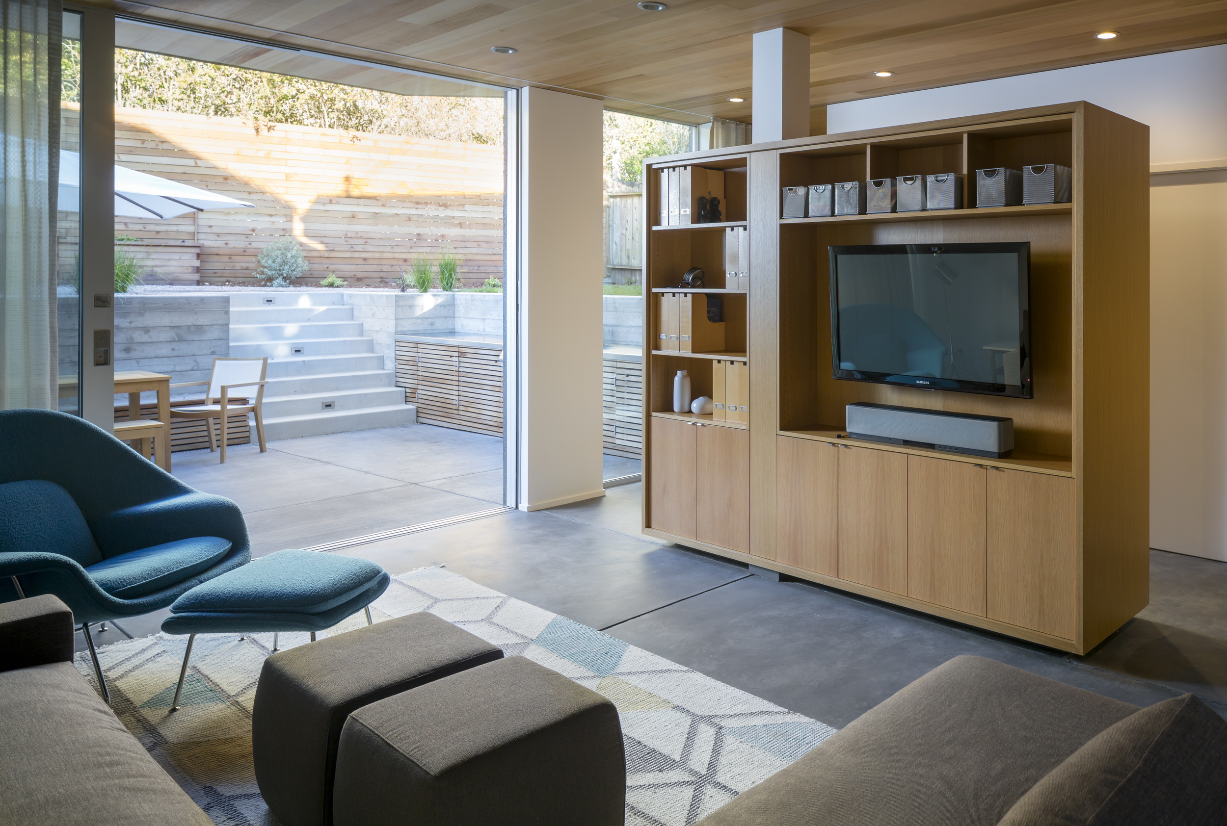
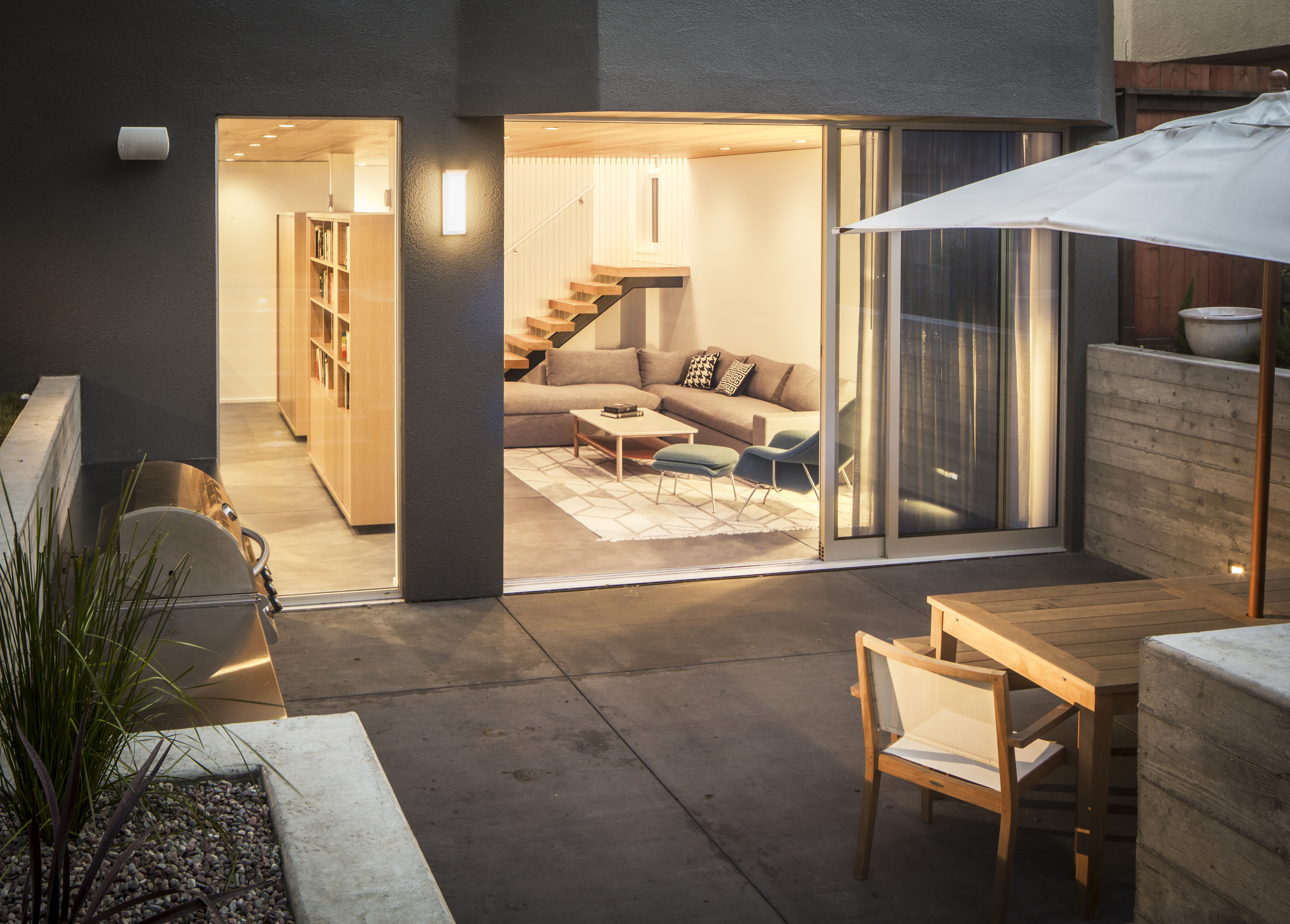
From the lower level, the enclosed stairwell is like a sculptural anchor and a play nook is tucked underneath. A ‘cool modern’ aesthetic is pursued as we go farther away from the stairs. Note the aluminum frames of the sliding glass doors set against the dark charcoal floor. On the back side of the stairwell, the same dark charcoal concrete steps up to a mud room with all casework painted bright white. An oversized sliding door conceals the laundry closet.
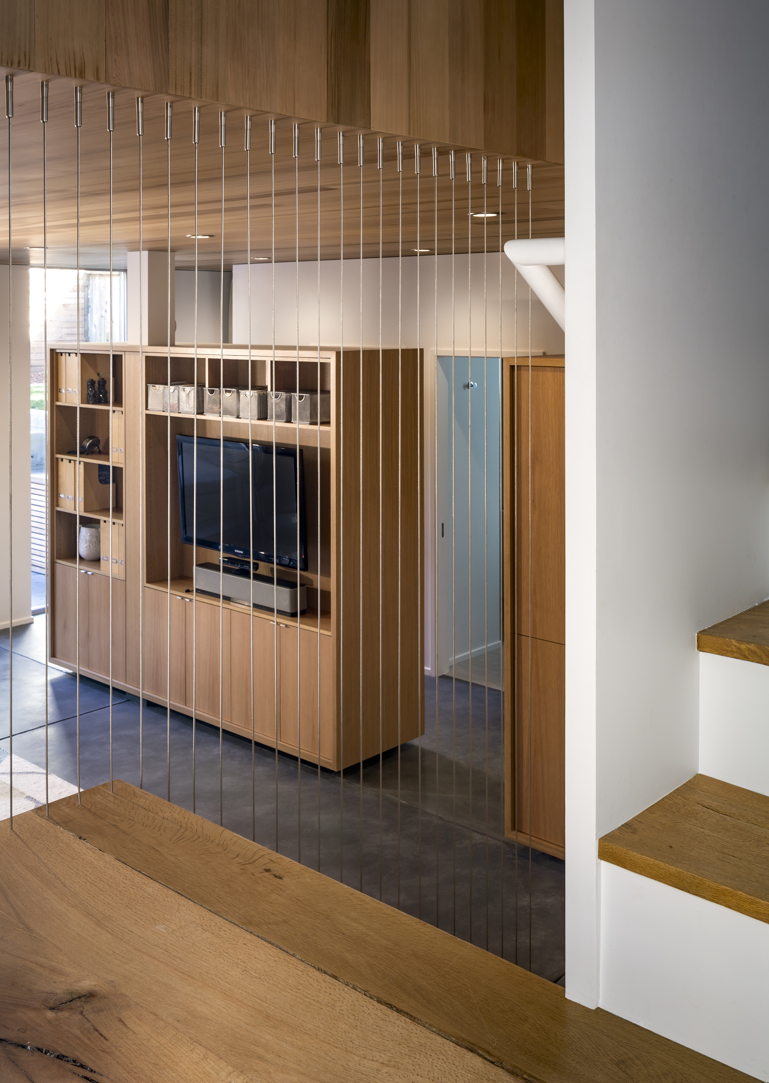
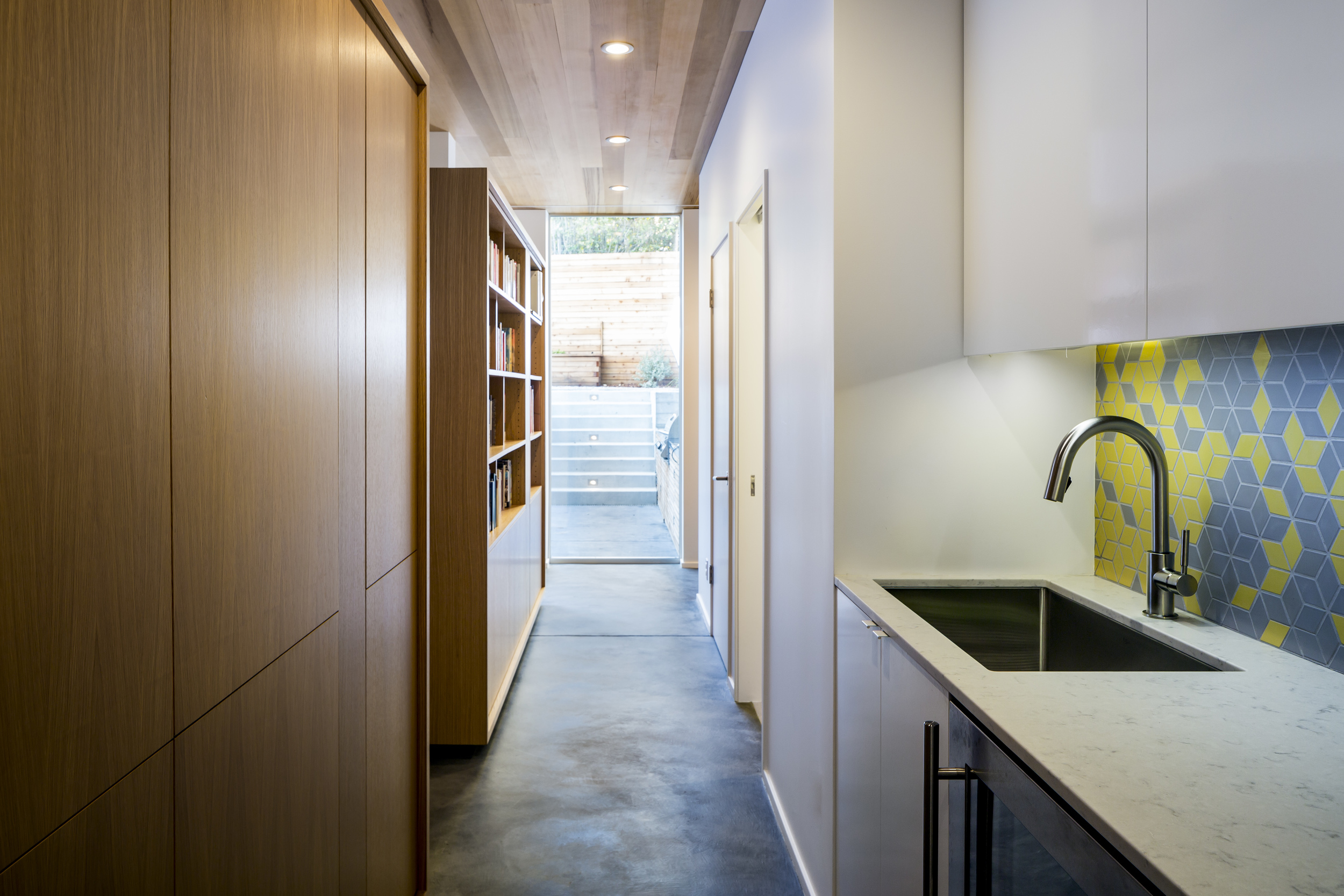
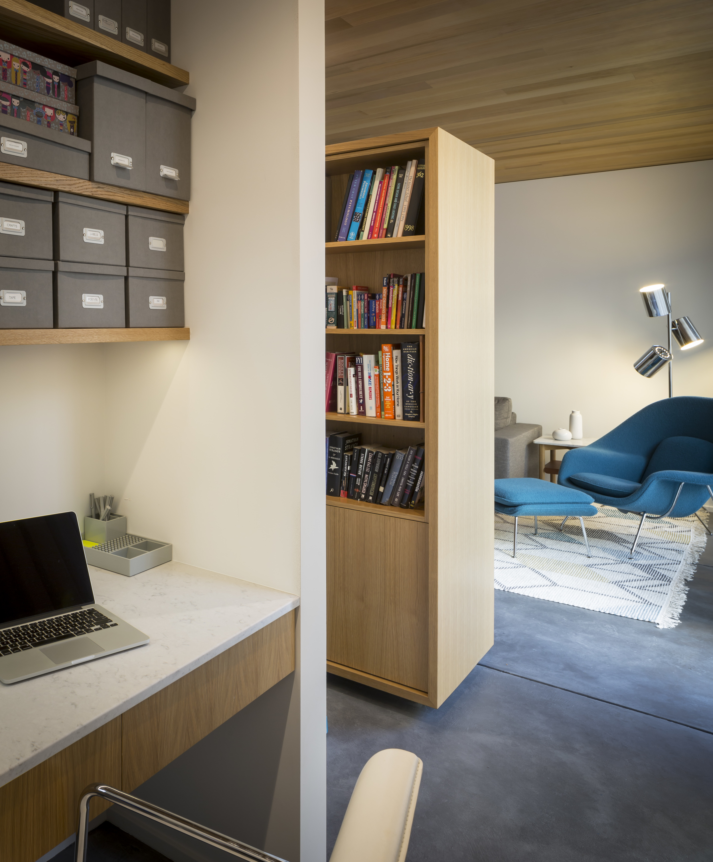
To address the second concern, the design team opts for expansiveness, simple elegance, and warmth. Extensive demolition, excavations, and rebuilding result in a 9-foot plus ceiling height throughout the lower level. Concrete slab floor with a matt charcoal cementitious micro topping is chosen for its cool modern look as well as easy maintenance. Cedar ceiling and oak casework provide a warm tone as a counter point. The oak cabinets house bookshelves, household storage, and an entertainment center. These tall cabinets define but not block off a corridor for access to the kitchenette, bath, and a home office. The compact home office occupies a quiet corner with a view to the patio and also a visual and audio connection to the activities in the main family space. Literal physical warmth is provided by radiant heat. An existing hydronic system for the main level comes with a boiler large enough to serve a new in-slab hydronic system for the lower level.
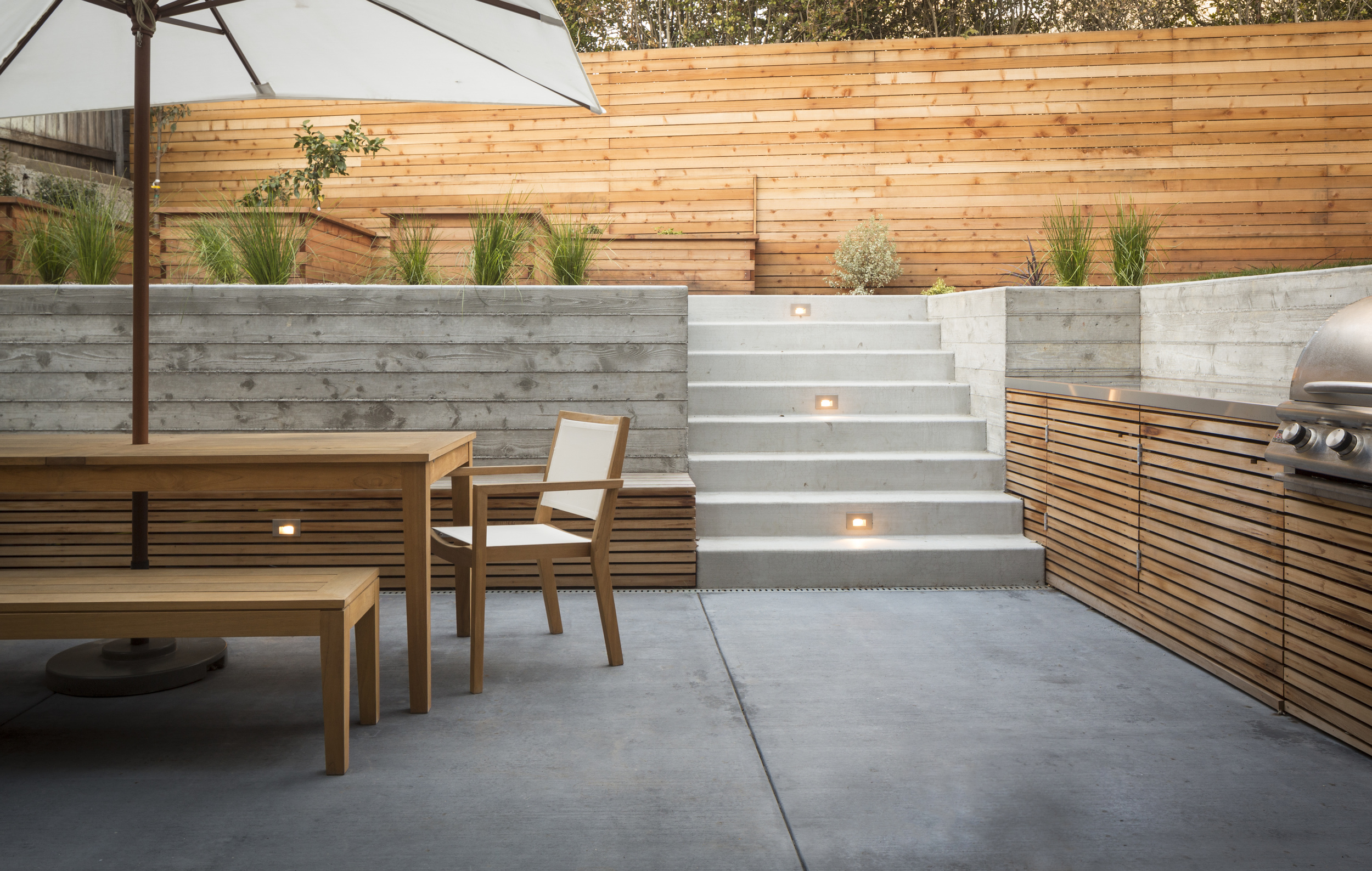
The decision to dig deep and the desire to have the patio as an extension of the interior creates a design challenge as the landscape has to step back up to the grade somehow. This is achieved by horizontal layering which leads the eye from the concrete floor to the wood bench, up the steps to the low retaining walls, the raised vegetable planters, and finally the fence with horizontal slats. Long row of cabinets line one wall. A built-in barbeque is set in a stainless steel counter. Immediately above is a small lawn for kids and dogs. Much attention is paid to the straight forward layout of the backyard which optimizes the utility and the visual simplicity.

