balboa drive residence kitchen & bath
balboa drive Residence
location | oakland
scope | main floor renovation
design | building Lab
year | 2021
Contrary to many urban projects in which we strived to create spaces by co-opting hidden closets and light wells, what we got here was a very spacious house in the Oakland Hills in need of articulation and improved connections and flow.
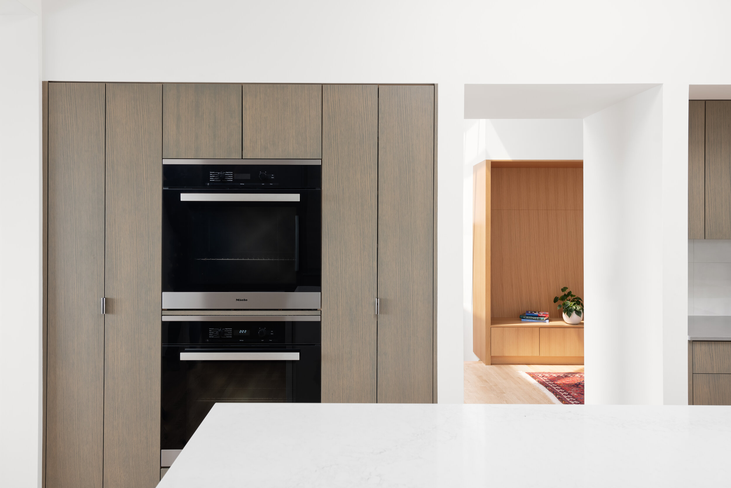
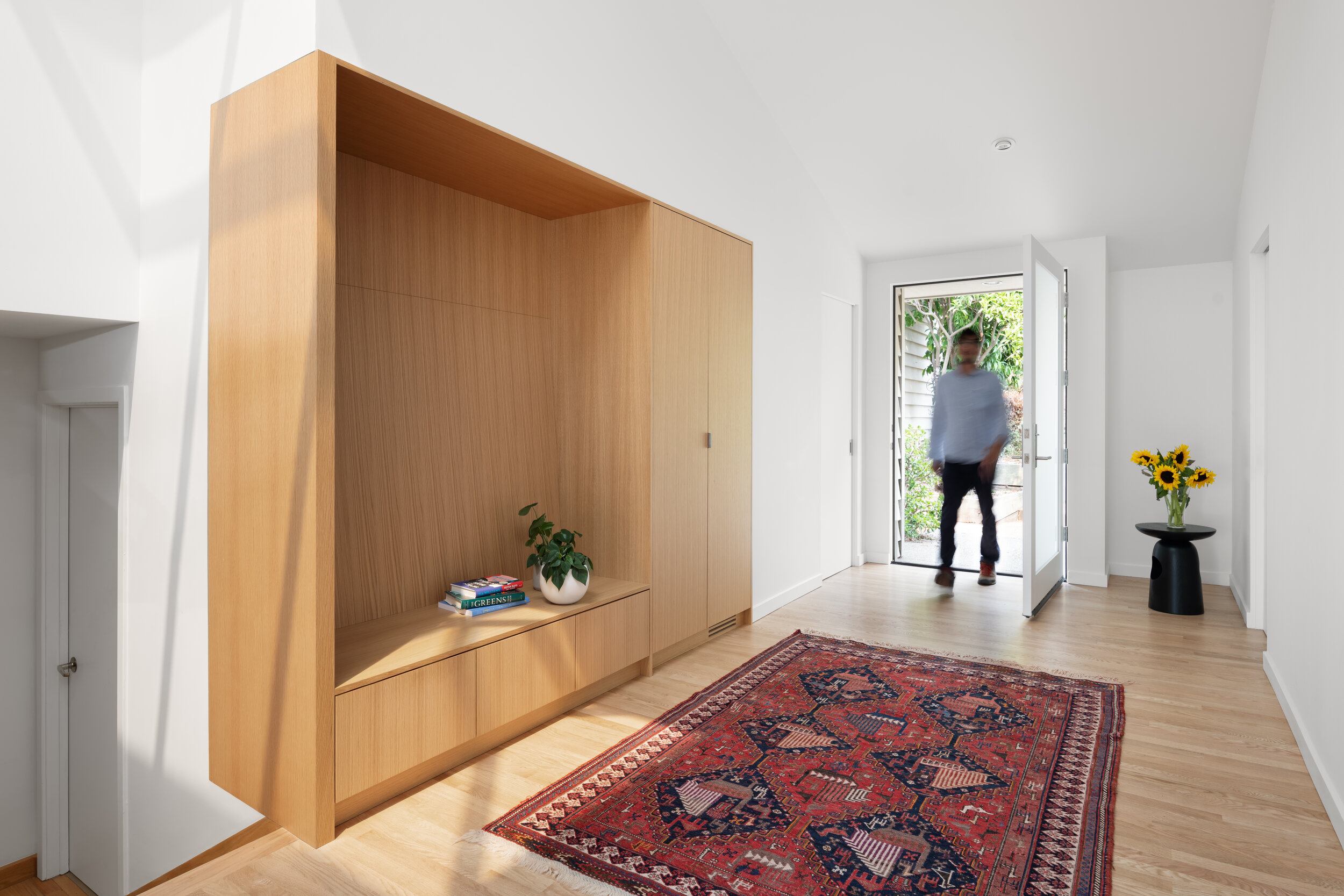
The existing layout had a staircase in the middle and special function areas radiating out to the corners: kitchen with an eat-in area, dining, living, master suite, and garage at the top of the stairs. Our priorities were to create an exceptional kitchen and improve the functionality and livability of the entire main floor for our client (a professional couple with a young adult child). These included greater access to the city and bay views from the kitchen and entry, and moderating the seasonal extremes in temperature due to the orientation and large skylights.
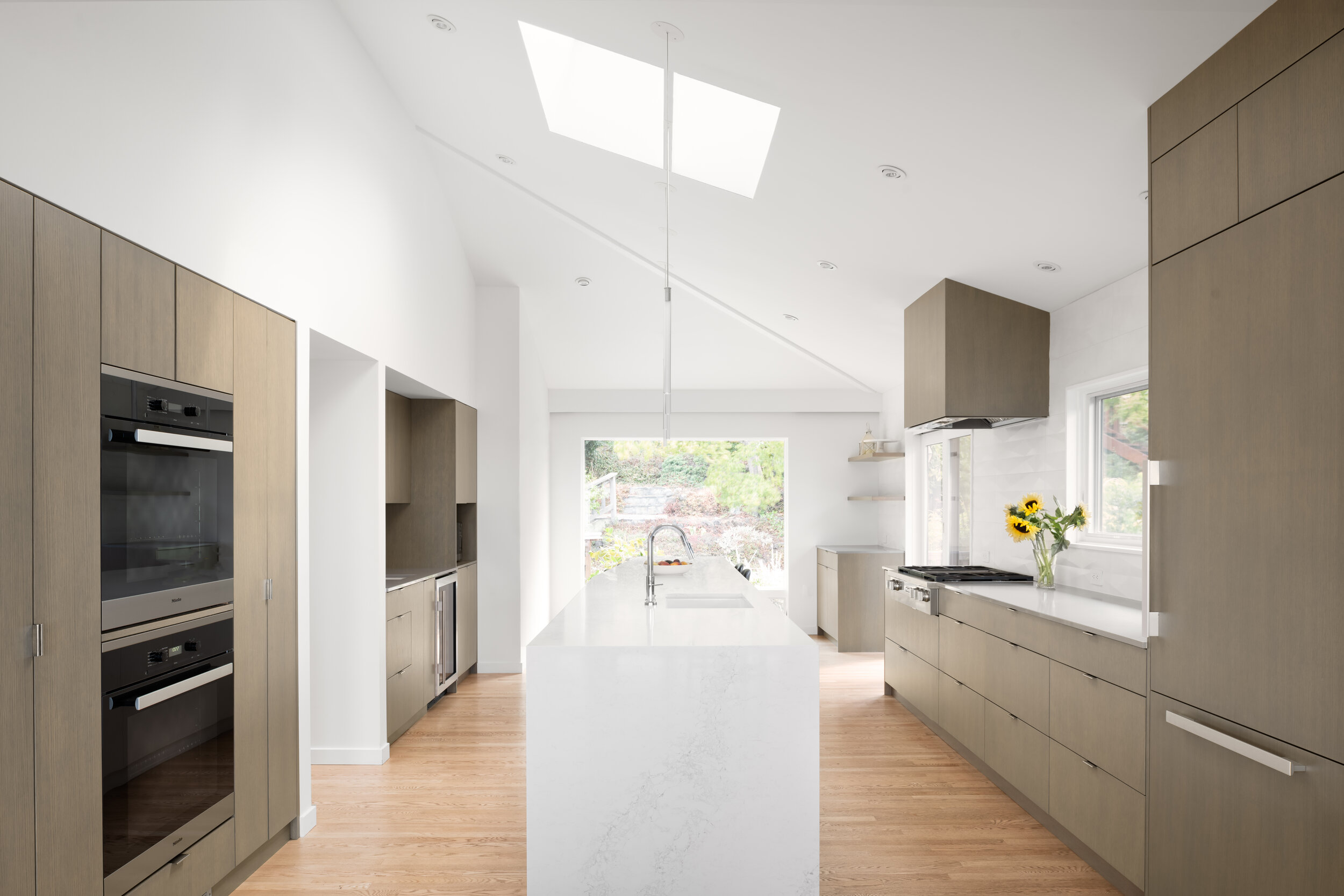
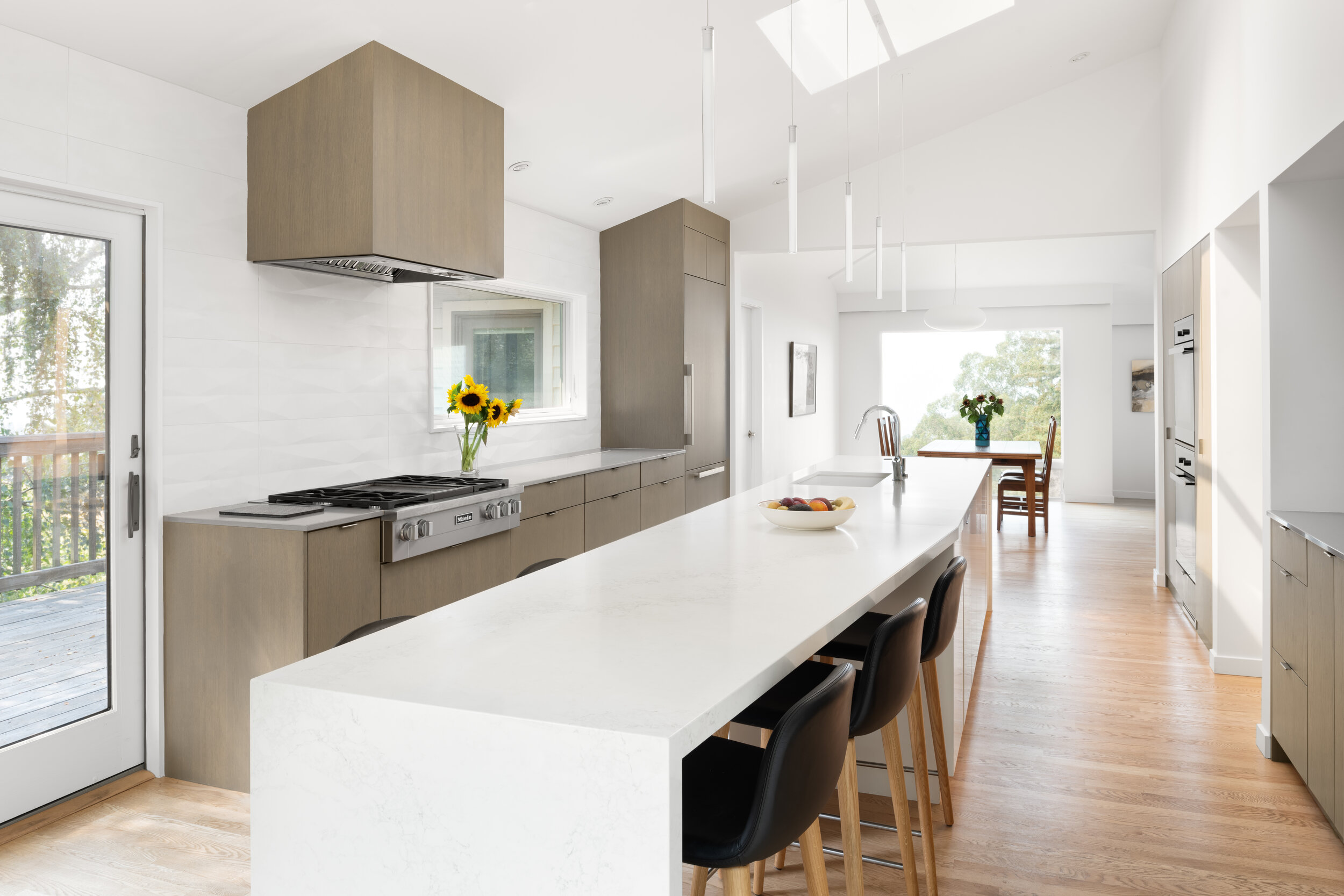
On one side, the wall separating the kitchen and dining is removed; on the other, a partition wall and all builtins are taken out to clean up the space. An 18’-long island is
installed at the center, topped with a caesarstone® countertop with waterfall edges on both ends. Instead of the original separate eat-in area, the tapered end of the counter serves as a breakfast bar with stools tucked below. A wall-mounted TV entertains the cooks and diners alike. This expansive space enables the kitchen as a center of family activities as well as party central.
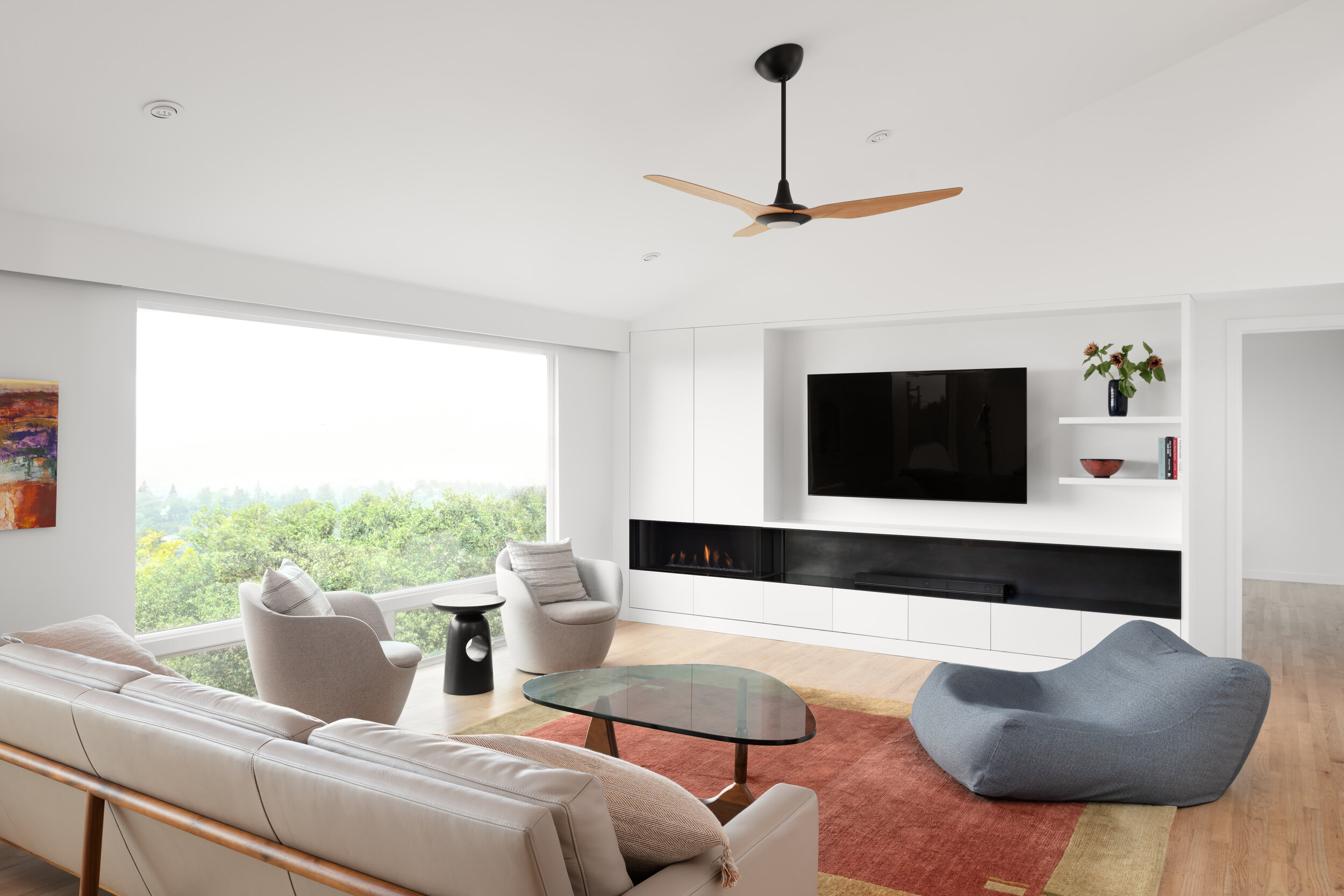
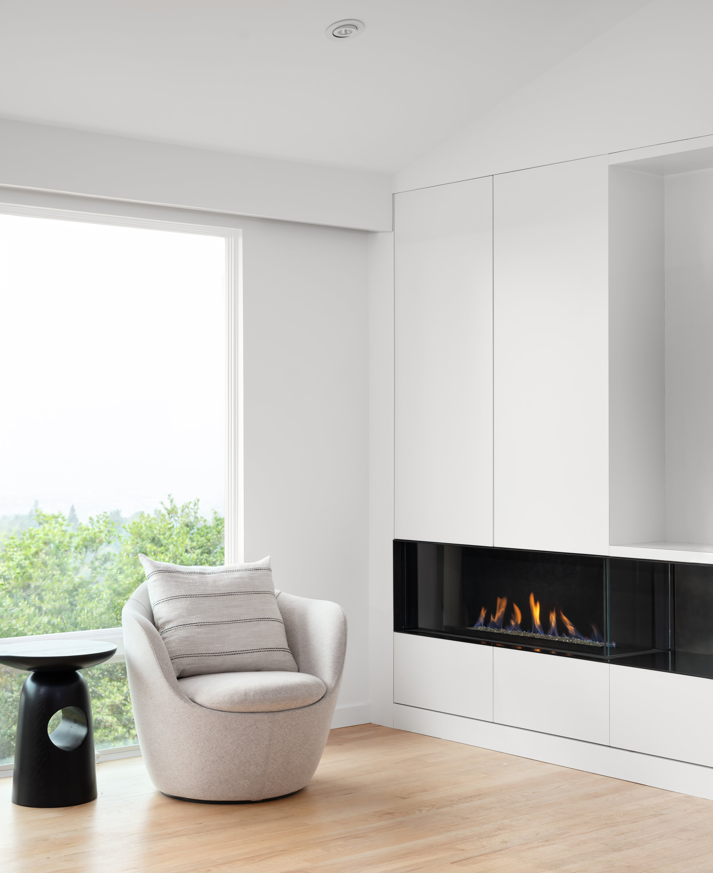
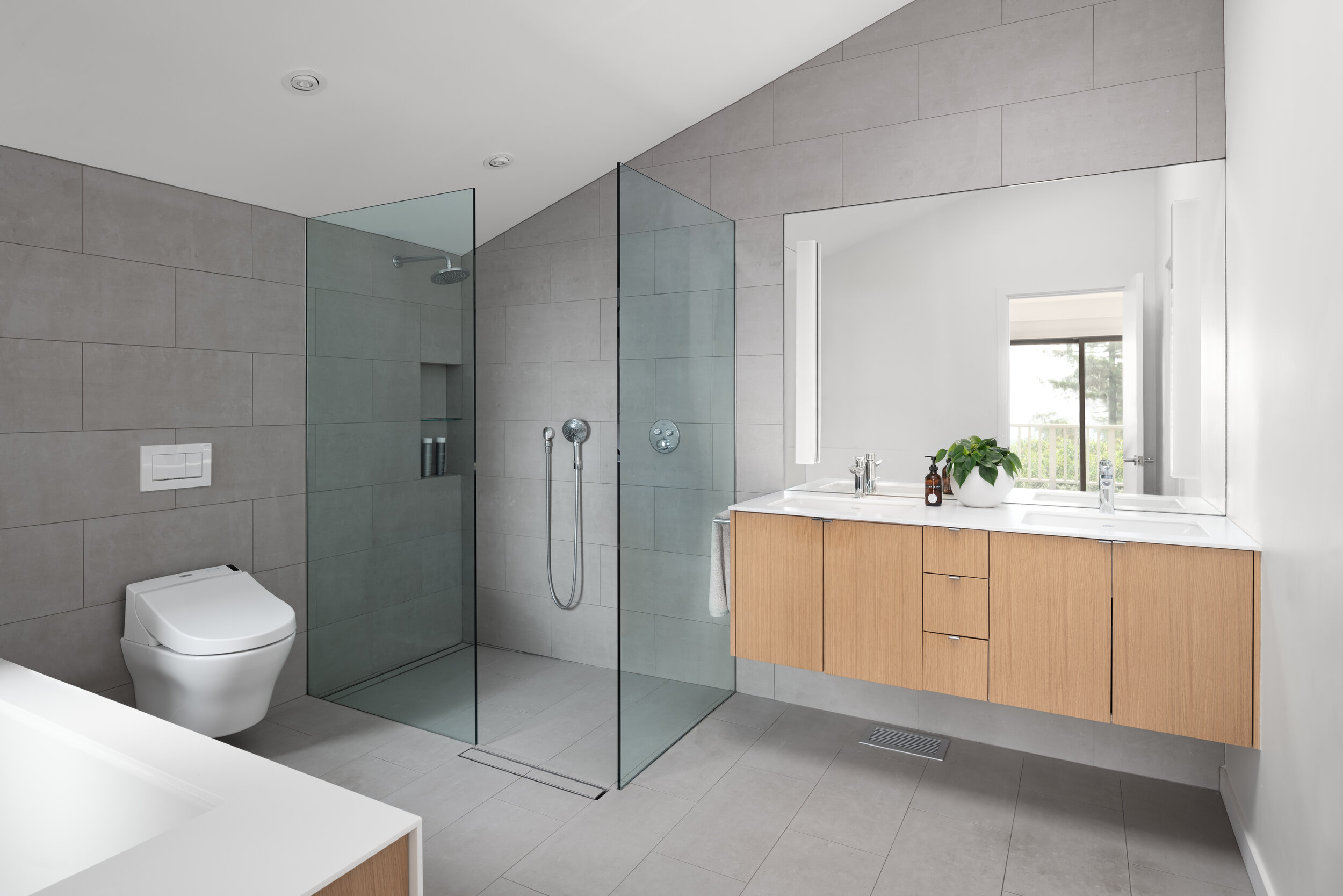
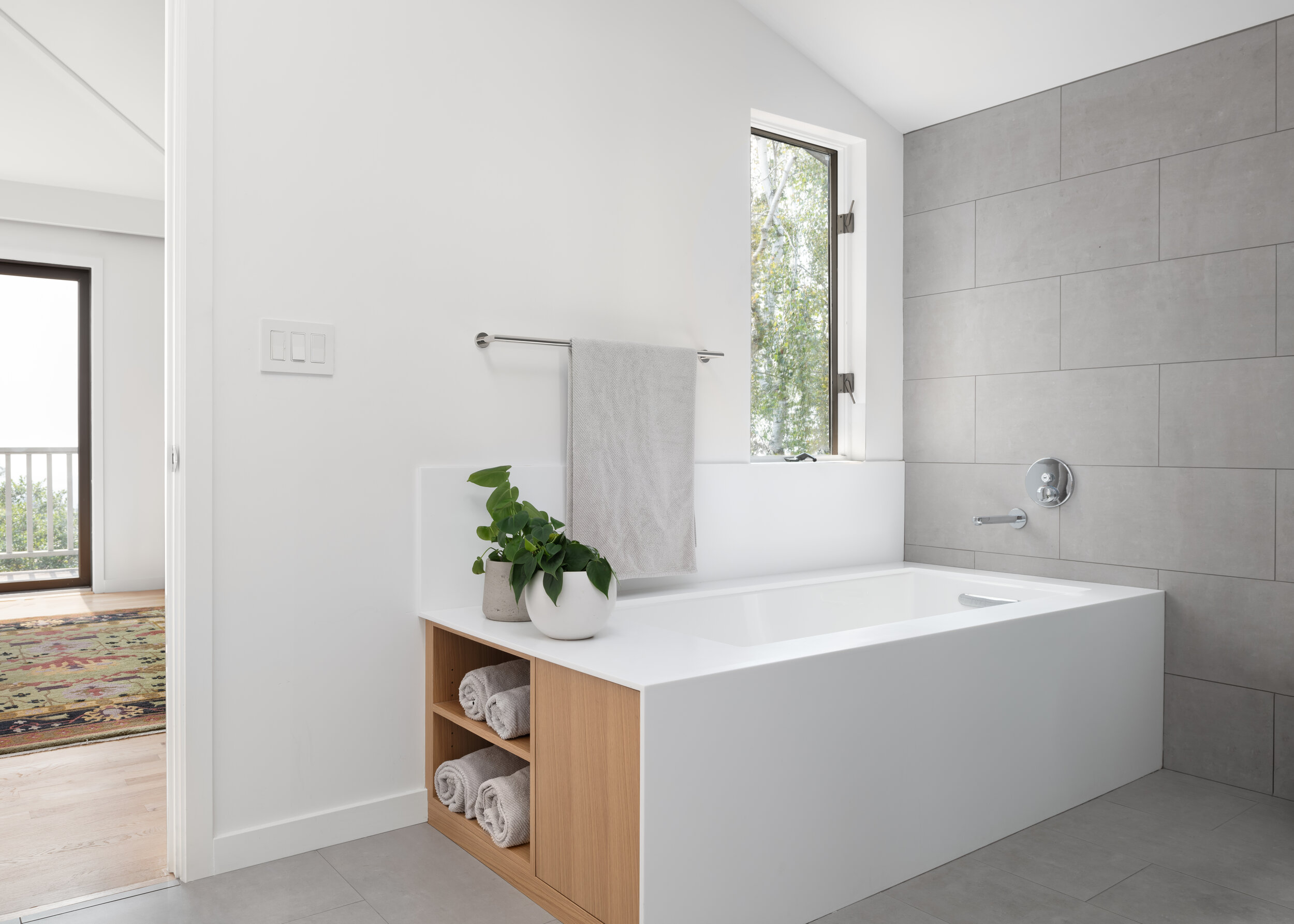
In order to create a more subtle transition from the public to a private area, a faccia is built to make up a thicker and more sculptural wall. The new gas fireplace is vented thru the thickened wall and out to the side. Built-in low cabinets and a large wall-mounted TV complete the entertainment center. The footprint of the master bath is left virtually unchanged: the wall separating the wet and dry areas is removed to create an open concept; curbless shower with glass panels disappearing into the wall; a new tub with custom storage at one end; the space is rendered with a tranquil palette and simple details.

